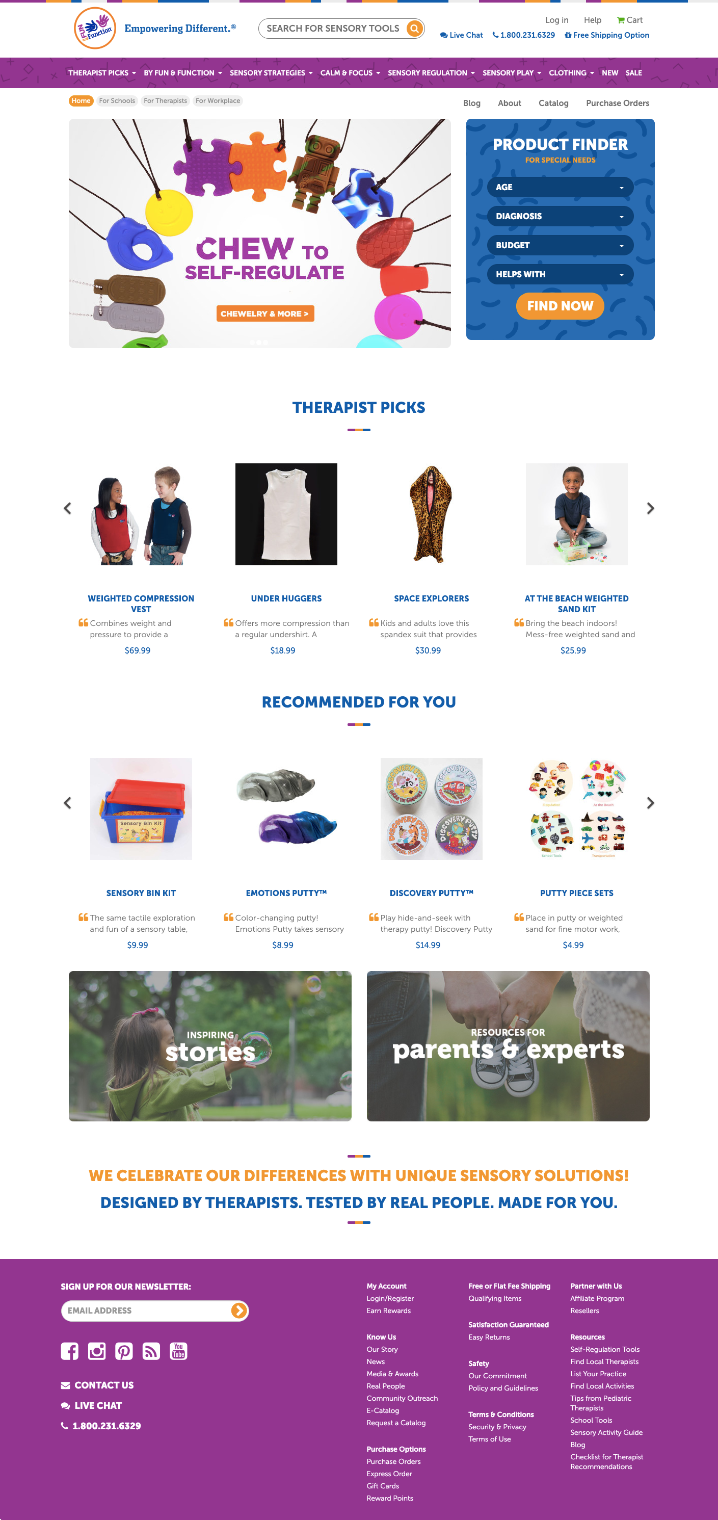
Fun and Function
Approachable and user-friendly product descriptions with personality


Background
When occupational therapist Aviva Weiss couldn't find kid-friendly sensory tools for her family, she decided to design her own. In 2006, she began creating fun, colorful tools for special needs kids. By combining play with therapeutic benefits, Fun and Function products help kids thrive in classrooms, therapeutic settings, and at home. Since 2015, I’ve been helping Fun and Function reach customers through easy-to-understand product descriptions. The world of occupational therapy is confusing and rife with jargon. We’re trying to make it more human.


Creating a style guide for consistency and clarity
Shortly after I began editing Fun and Function's online catalog, I spearheaded the creation of a formalized style guide and product description template. The editorial team collaborated to create a consistent yet flexible format that served a variety of products. This ensured that descriptions for hundreds of products would be informative, comprehensive, and scannable.
Our goal was to ensure each description could quickly help customers identify therapeutic benefits to understand if a product met their needs. Across all products, customers can now find the same types of information in the same place.

Iterating and improving upon the catalog creation process
Fun and Function sends their annual print catalog to customers, schools, and occupational therapists. It’s a project with many moving parts. This collaborative effort involves many teams, including in-house therapists, merchandising, production, and editorial.
As the catalog had expanded year-over-year, the content had lost its consistency. Descriptions were varying lengths or incomplete. Important details such as dimensions, materials, and colors were a little all over the place. It was a meticulous and time-consuming process to cull through hundreds of products, track down relevant information on each, and develop a consistent format. But I’m a stickler for details, so I enjoyed the challenge.
The catalog evolves every year with new product additions and discontinuations. After many iterations, we now have a streamlined process where I begin content work with the product development team as soon as a product passes testing. This ensures that no details get missed as new products get added to the catalog.
2018 marked a big change for the entire catalog’s design. I worked closely with the merchandising team to consolidate redundant content and free up room for more prominent product photos.

Continually improving content to meet customer needs
We’re always looking for opportunities to improve and clarify content, especially based on customer feedback. For example, customer service let us know people were reporting that our essential oil-infused therapy putties “smelled weird.” We realized customers were more familiar with artificial lemon, lavender, and peppermint scents. So I adjusted these product descriptions to highlight the benefits of essential oils and better set expectations about their natural scent.
“There are other stores that carry almost the same merchandise at similar prices, but Fun and Function goes the extra mile in product description and categorization. This helps you imagine the product in your home environment.”
“Working with Betsy is a pleasure. She is talented, creative, and very responsive. She crafts and tells our story to the world in a way that the reader is drawn in and feels connected to our mission while obtaining details and information that could otherwise be dry. ”