
Wikimedia Foundation
Clear and consistent content for a global, diverse audience

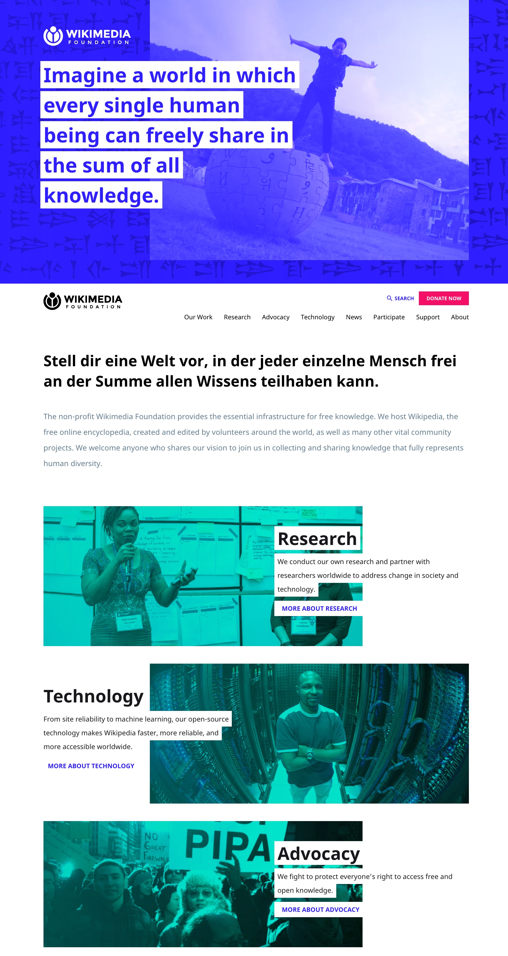
Background
The Wikimedia Foundation is the nonprofit that hosts Wikipedia, the fifth largest website in world. I helped reshape content for the foundation’s newly redesigned website. The site’s primary goal was to better educate external audiences on the foundation’s mission, projects, and initiatives. I immersed myself in the complexities of the organization, distilled what was important, then designed clear, simple content. Then website was then localized into several languages.
Solving for content overwhelm
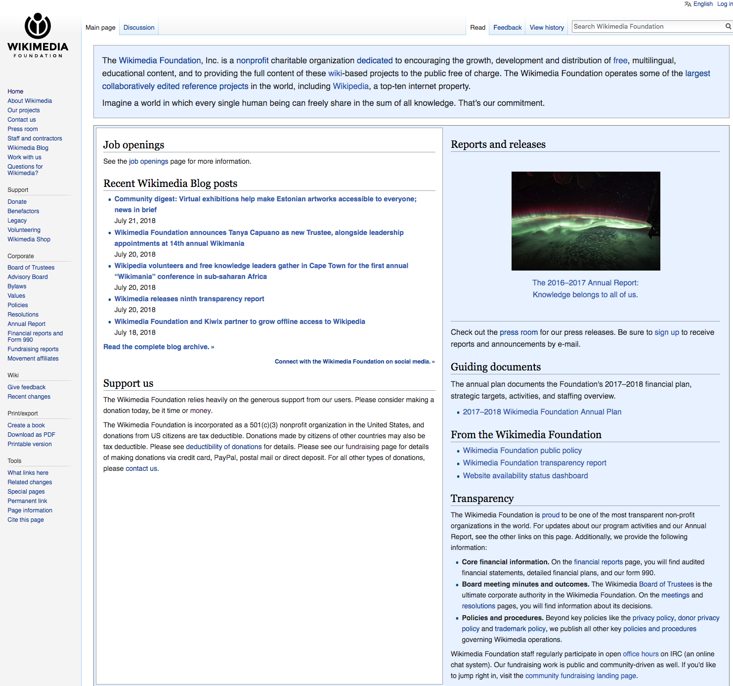
The previous Wikimedia Foundation homepage was heavy with content and links, making it difficult to absorb information. It felt like more like an academic journal than a welcoming nonprofit homepage that invites exploration into its work. It was easy to get lost in this deep, dense web of complex material.
This was natural, as the website hadn’t truly been redesigned since it was initially launched 10 years prior. Content had been added by many different editors over time.
Identifying which portions were relevant for the new public-facing website involved a significant amount of editing. In some cases, entire pages or portions of content were not carried over to the new site. These were sensitive and sometimes challenging conversations for the organization.
Streamlining the path for information discovery
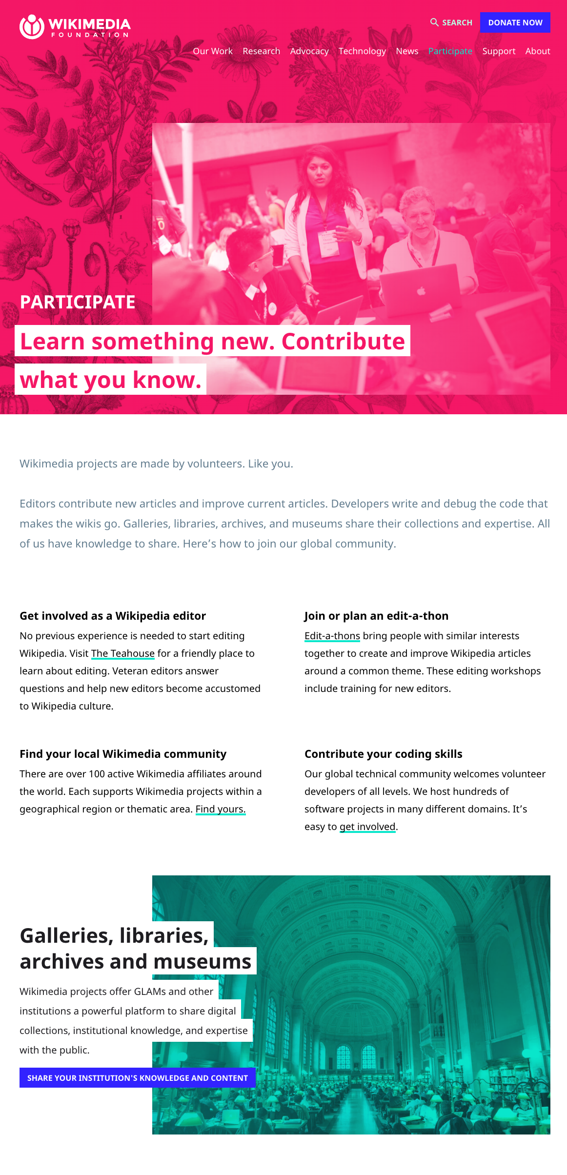
Visitors to the website include donors, volunteers, job seekers, journalists, and researchers. All seek different information and come with varied knowledge about Wikimedia Foundation. We designed content to meet people where they were. Short and simple copy gives users a quick read on the foundation’s mission and projects. Active voice keeps content concise and direct. This also made the website easier to localize.
Iterating and refining to radically simplify
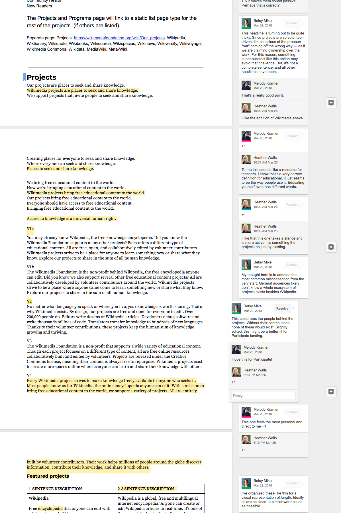
The new site was an opportunity to think thoughtfully and strategically about how Wikimedia Foundation wanted to communicate. I presented multiple versions of top-level content for stakeholder review, which invited discussion. Would a global audience understand this? Could a stronger, more active verb make a headline more clear? What was the just-right amount of information to share about a particular project or initiative? These conversations ultimately led to content that was more considerate to end users.
Crafting a clear, consistent message
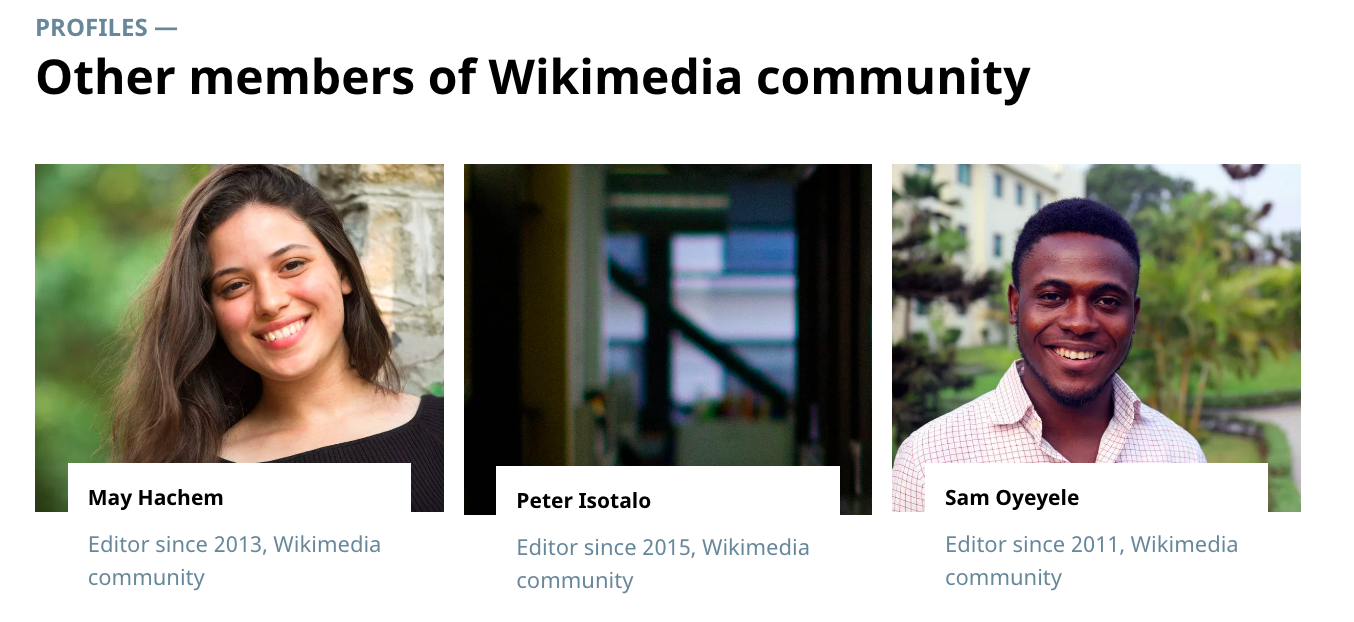
We also revisited and improved existing content. The foundation had several community profiles that had been written by various editors over time. Each was strong on its own. But as a group, these pieces of content lacked consistency. I edited the profiles for clarity and length, while unifying their voice and tone with the rest of the site content.
“Betsy was an absolute pleasure to work with: she dove into incredibly complex material, managed a series of stakeholders (and feedback), and designed all of the content for its intended audience and on time. Her feedback made our site and content stronger.”