Oak Street Health
An accessible, inclusive healthcare experience for patients


Background
Oak Street Health is a network of primary care practices for patients on Medicare. The company is expanding quickly to new markets. In partnership with web design firm One Design Company, I helped create a new website to support their patient acquisition and recruiting goals. I owned content strategy efforts to design an accessible, inclusive site that aligned with business goals. I also led discovery workshops, conducted user research, and wrote all copy for the site.

Reimagining the website experience
The current website had been quickly launched for open enrollment the year prior. It covered the basics, but did not articulate the company’s mission and values. The hierarchy of information was confusing, and the templates were not flexible to accommodate different types of content.
Patient acquisition was the main goal, but the site also needed to support recruiting efforts of office staff and medical professionals. The company was hiring like crazy, and the website needed to more effectively tell the Oak Street Health story to attract top talent.

Understanding target website users
To design the best experience for Oak Street Health, we needed to understand the complexities of their business and their target website users. Through formal interviews, informal conversations, workshops, contextual research, and observational visits to Oak Street Health centers, we learned everything we could. I led several sessions with stakeholders and synthesized our learnings. From these early stages, I began to formulate user-centered content practices.

Pairing plain language with simple visuals
Most people on Medicare are 65 and older. This was our primary audience. Accessibility considerations included type legibility and tech literacy. Content also had to be easy to read and understand for ESL and lower-literacy users. To make content more accessible, I used Hemingway App. It helped me identify reading levels and reduce sentence complexity .
Since this audience would primarily access the site on their phones, we took a mobile-first approach in wireframes. This challenged us to keep content concise every step of the way. Thanks to tight-knit collaboration between content and design, we were able to communicate simply and plainly.

Providing support for Medicare patients
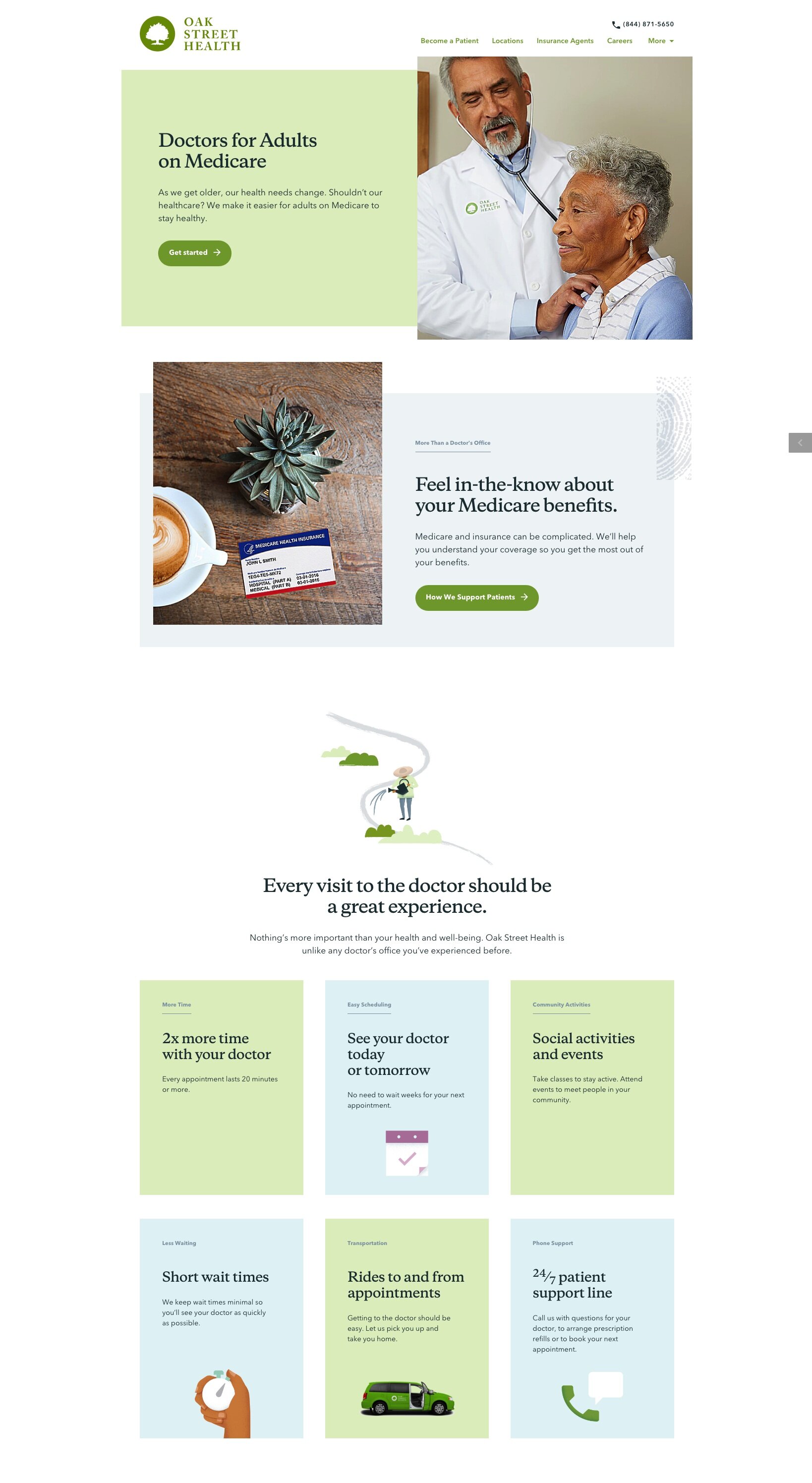
When visited the centers, we had seen the images of the Medicare card plastered everywhere. Many incoming patients aren’t sure if they are eligible to receive Oak Street Health services, and this card provides an instant read about the coverage Oak Street Health accepts. We reinforced that in-person experience with the same visual on the website’s homepage.

Bringing forth the Oak Street Health mission
Oak Street Health takes a different approach to primary health care, focusing on keeping patients happy, healthy, and out of the hospital. Every single person we talked to — from staff at Oak Street Health centers to its executive leadership — talked about how fulfilled they felt working for a mission-driven organization. It was important to highlight this on the website, so we designed a mission page that told this story.

Showcasing the faces of Oak Street Health
On location-specific pages, we featured the providers’ photos, medical expertise, and quotes. Collecting this information for 100+ people proved to be a challenge. It didn’t exist in a consolidated, consistent format that could be used to populate the site. So I designed a survey to request specialties, titles, and quotes from the providers directly. It took several iterations to get it right. I worked closely with our website developer to ensure the data would be clean and easy to plug into the CMS.
This was a collaboration with One Design Company: Stacey Donaldson, Michael McMillan, Michael Mesker, Stacey Shintani